
Travel SAFE app was created for travel enthusiasts where they could have safety features along with them everywhere they go. The main aim of this app is to make travellers and explorers safety by introducing emergency features on-the-go.
This was my first ever UX project that was done during my time in the Interactive Media Practice program at the University of Westminster in 2021.
One of the biggest detriments of traveling to a new place as a woman is a safety
They want to feel safe and also have fun and explore the place as much as they can
They want an online platform where they can decide where they want to go and explore alone or with friends/ family
Not stressing too much about the journey but rather enjoying it to the fullest
An app that provide users the safety features on the go of their journey
Provide an explore features to get an overview of different places beforehand
Planning their journey and making a travel itinerary of their overall journey so they can get alerts and emergency numbers on the app to use when required
Emergency feature to use on their journey if they need any help on their journey as the place would be new to them
Initial market research was conducted to gain more insights in the travel industry and to understand the main concern people face during travelling and why. I wanted to identify the core aspect of the issue in order to design a better experience.
Even though 2020 made us forget about traveling for some time and is gonna take a little while to get back on track. But when it recovers it gonna have such a big addressable market and is expected to reach 450 million USD by 2024.


Top regions people like to travel to according to World Economic Forum.
Nearly 90 percent of traveler expressed some degree of concern for safety while traveling according to new findings in the annual Global Rescue travel safety survey.

.webp)
Then I did competitive research on several market-leading peer products to see what they have don't well, and what pitfalls they failed to avoid.

Since travel apps are filled with booking and exploring of the places. This apps main aim focused on the emergency and safety features to make it more approachable and usable when in need.
Primary Target Audience
From the research insights the primary target audience is women aged between 20-40 who love to travel around new places and explore as much as they can. Their primary concern while traveling to a new place is their safety. They have full-time jobs and consider themselves as social people.
Secondary Target Audience
The explorers and planners male audience who also loves to travel and wanted to have a full overview of the trip and likes to plan their trip days beforehand and would like to have a safety feature in their phone just in case they would need it.

Based on the research, I started narrowing down the scope of the project, creating a persona and empathy map of the primary target user. That ensured the further design decisions stayed user-centric.


Based on the insights obtained from the research analysis and user personas, I was able to develop the key features to establish the MVP of the app. Additionally, identifying these features allowed me to create user stories based on what the target audience would need to utilise a safety app for traveling.

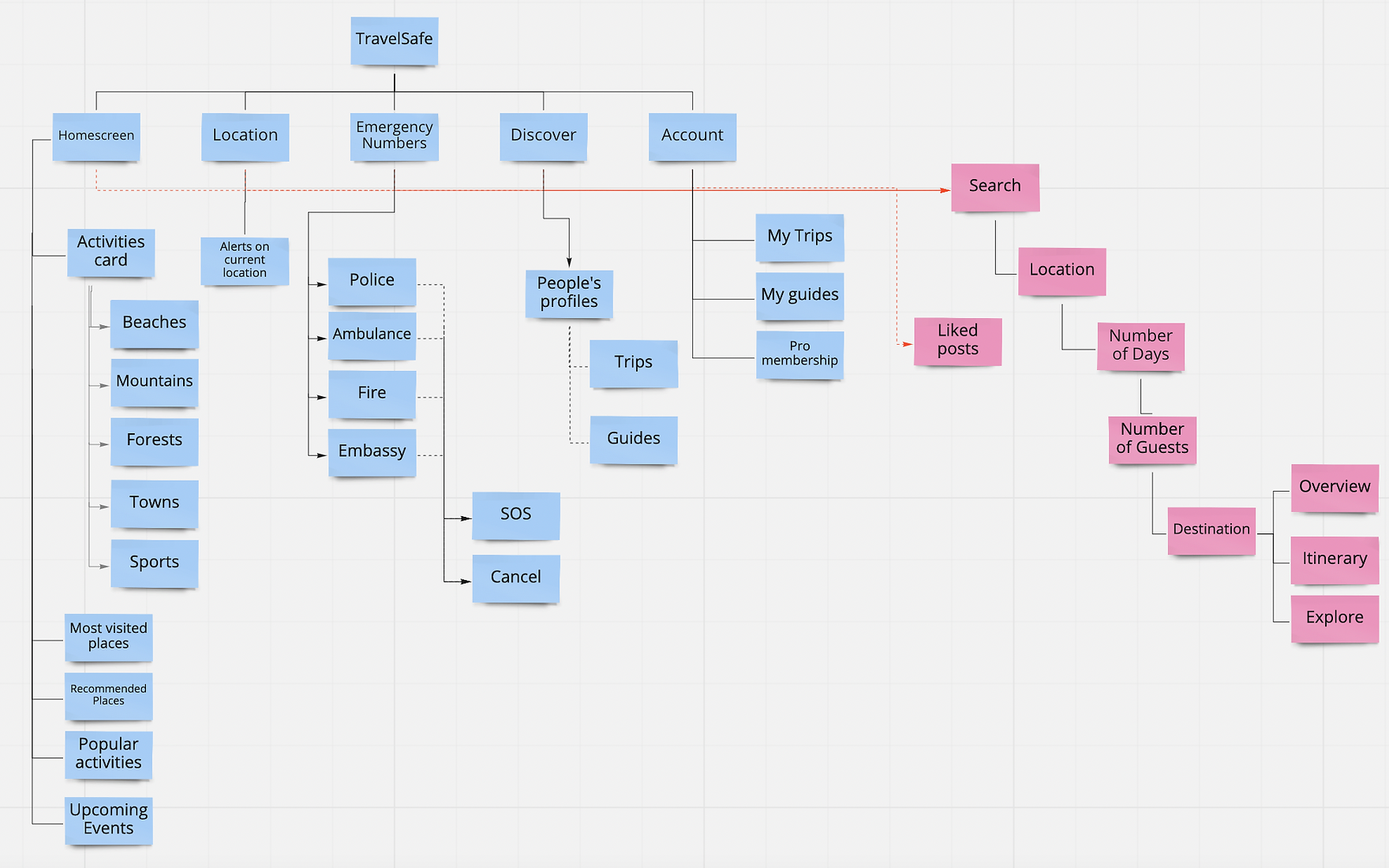
After deciding what features to include, I created a site map to define the overall content structure of the app. The goal is to make a logical and easy route for users to navigate to reach their main goals.
This user flow is based on the persona of Kyla when she is exploring this this app after their friend decide to go for a trip to Paris. Her main goal get an overall overview of her travel destination and share it with her friends and get their comments.

By focusing on the quality of information instead of the quantity and approaching the design and UX with careful consideration of the end user, we were able to design an app that makes discovering main features more approachable.
Then we defined the brand attributes of our app which were effortless, enjoyable, calming, optimistic, encouraging. According to these adjectives, we created a vision board where we gathered images, words, sentences that reflected the brand attributes.

Then we defined the brand attributes of our app which were effortless, enjoyable, calming, optimistic, encouraging. According to these adjectives, we created a vision board where we gathered images, words, sentences that reflected the brand attributes.


Homescreen categories & sub-categories
Homescreen is the main stop of the app where users could explore different destinations they are interested to travel. Every section is divided so it is easier for the user to find what they are looking for.
Filter out your preferences
Every destination could be filtered out by users interests to the place with amazing iconography.
Book effortlessly
Every step is linear to the previous which is connected to each other by selecting the date and guests users are travelling with. At later stage, if they want to build their personalised itinerary they can. Also, suggestions are given alongside if they no idea about the place. They are allowed to explore other people's suggestion or blog in the explore section.
Location based Warnings!
This is one of the main feature of the app in which users are told if the destination they are travelling to is safe to go or not by giving (example: flood) warning of the weather or the restrictions of that are.
Moreover, when users reached the destination it provides the warning according to path they are going to (example: road closure) so they could change the plan or be prepared beforehand.
Emergency contacts in-hand
Are you in trouble on your trip? Worry not. With this new feature users automatically get connected to the local emergency number. They just have to turn ON their location all time. In emergency just tap the button and your call is diverted to the experts.
Discover new places along with people
Discover feature could be used to explore different places, activities and events that is personally suggested by the people with ratings and reviews. Are you confused where you like to travel to? What would you do their? Would it be worth your time or money? This got you covered.
Personalised account guide
If users want to share their own personalised experience of the trip they can share their guide to the world. Their experiences could be rated and reviewed.
Go PRO to get full experience
Since the business model of the app is freemium, the users are allowed to use only certain features to some extent. To get the full use of the app buy full version and travel effortlessly.

